
Guide · For coaches
What a Coach Can See: Performance Metrics and Charts in 42Runs
Coaching an athlete remotely depends on having a clear view of how their training is progressing. The calendar shows what was planned and what was completed, but it does not show whether the training is producing the intended adaptations or whether the athlete is carrying too much load.
42Runs gives coaches access to a set of performance metrics for each connected athlete: Fitness, Fatigue, and Form, Training Load Ratio, VO2max, Endurance Score, Time in Zones, Personal Records with the Pace Curve, and Sport Mix. This article describes what each metric shows and how it can be used.
Fitness, Fatigue, and Form
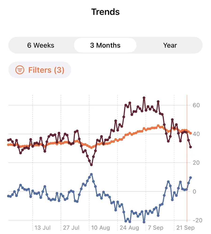
These three metrics describe how training load builds up over time. Fitness reflects training absorbed over roughly six weeks, Fatigue reflects the past seven days, and Form is the difference between the two.
For a coach, the trend matters more than any single value. A steadily rising Fitness line indicates that training is building as intended. A Form value that remains strongly negative for many weeks may indicate that the athlete is not getting enough recovery. A chart combining completed training with the workouts already planned on the athlete's calendar makes it possible to see how upcoming sessions are likely to affect these numbers.
A full explanation is available in our guide to Fitness, Fatigue, and Form.
Training Load Ratio
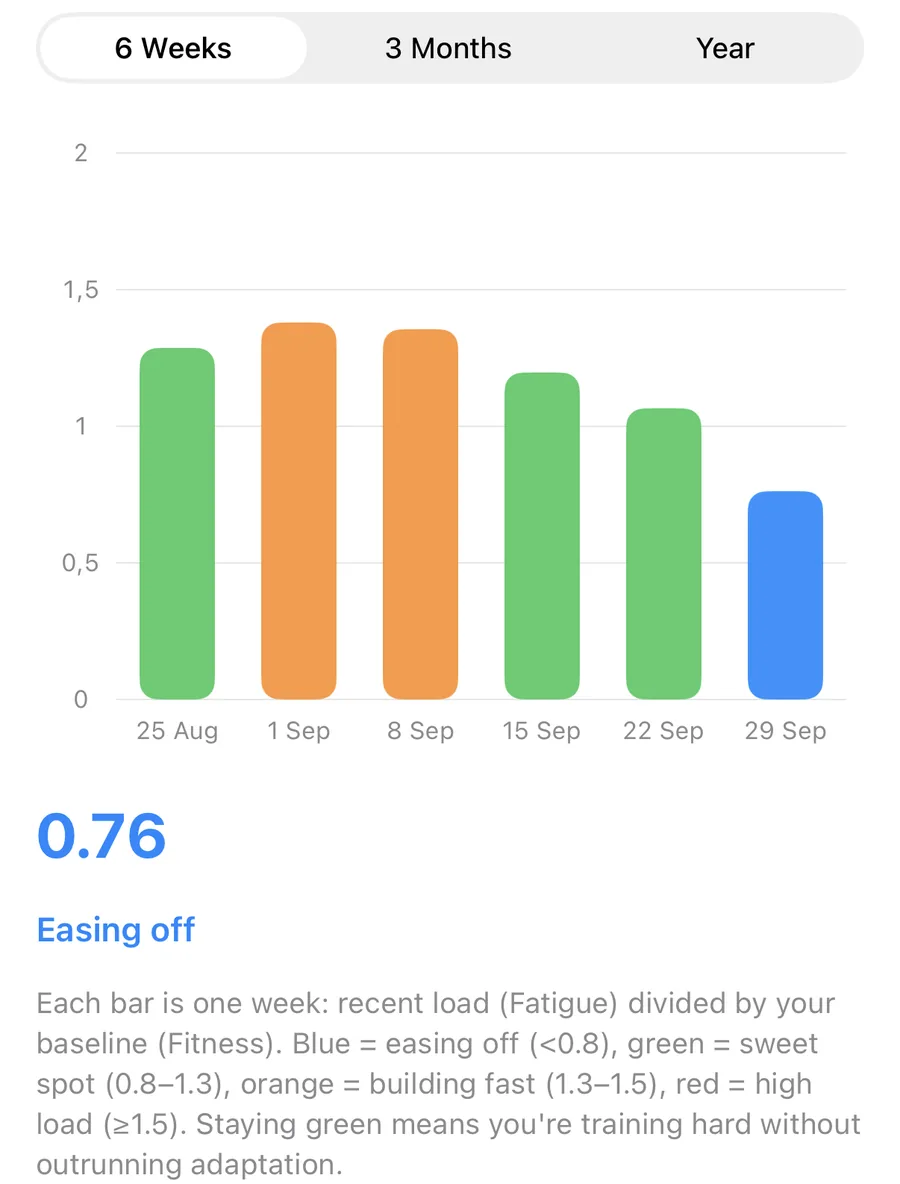
Training Load Ratio compares recent training load (Fatigue) with the athlete's longer-term baseline (Fitness). A ratio around 1.0 means that recent training is in line with what the athlete is accustomed to.
The ratio is displayed with ranges that indicate whether load is easing off, within a sustainable range, building quickly, or significantly higher than the baseline. Rapid increases in training load relative to an athlete's baseline have been associated with a higher risk of overuse injury in sports-science research, making this ratio a useful early signal when adjusting a training plan.
VO2max
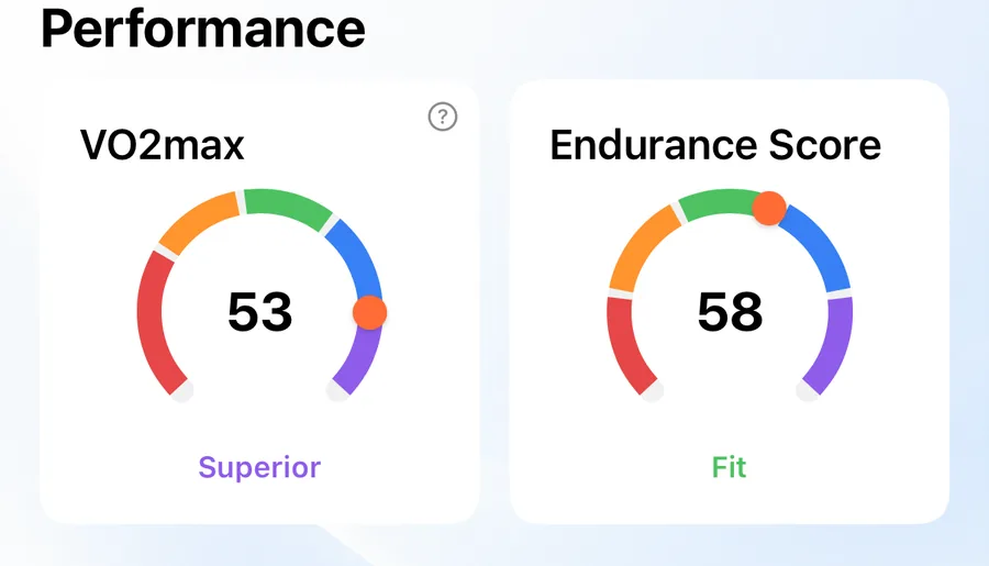
VO2max is an estimate of the maximum rate at which the body can use oxygen during exercise and is one of the most widely used indicators of aerobic capacity. The value is typically estimated from heart rate and pace data recorded by the athlete's watch.
Where an athlete's sex and age are known, the value is also placed in a category relative to others of the same sex and age group. The weekly trend shows whether aerobic capacity is improving over the course of a training block.
Endurance Score
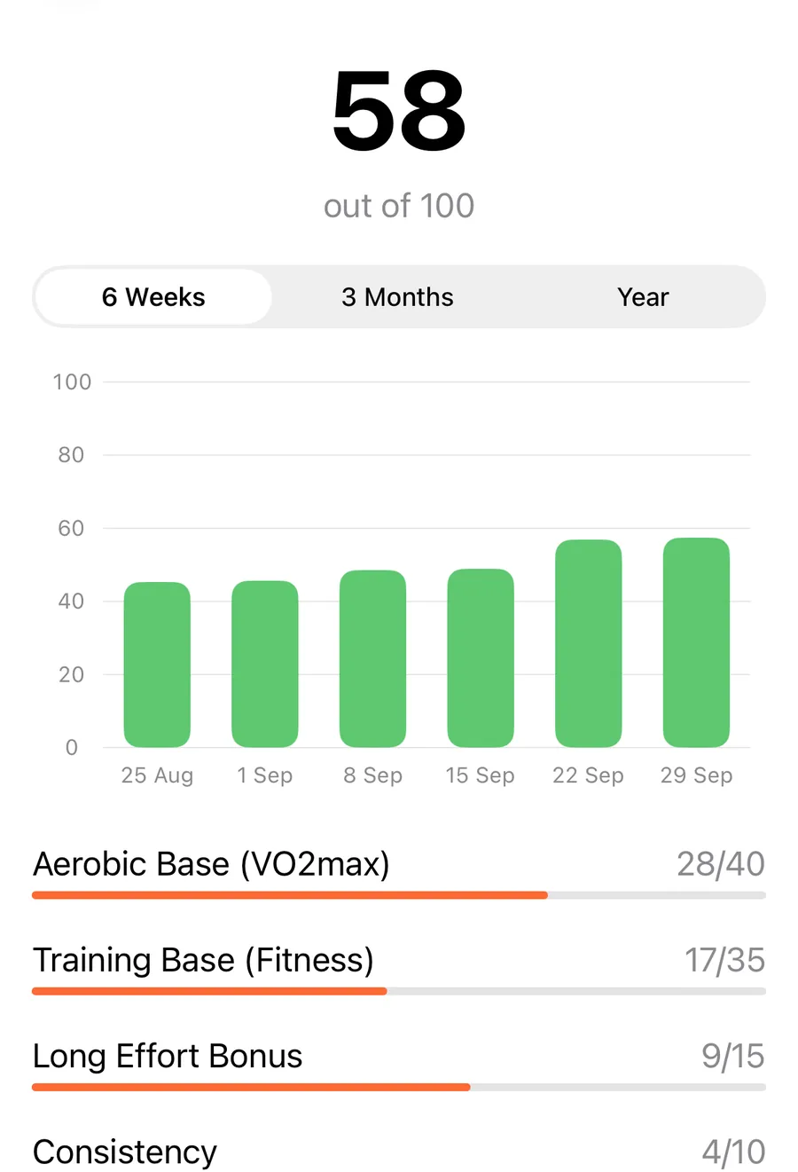
Endurance Score is a score out of 100 that combines several factors into a single indicator of endurance fitness: aerobic capacity (VO2max), training base (Fitness), the presence of longer efforts, and training consistency.
Because it combines several inputs, Endurance Score provides a broader picture than VO2max alone. An athlete with a high VO2max but inconsistent training will score lower than one with similar aerobic capacity and a steady, well-structured training history.
Time in Zones
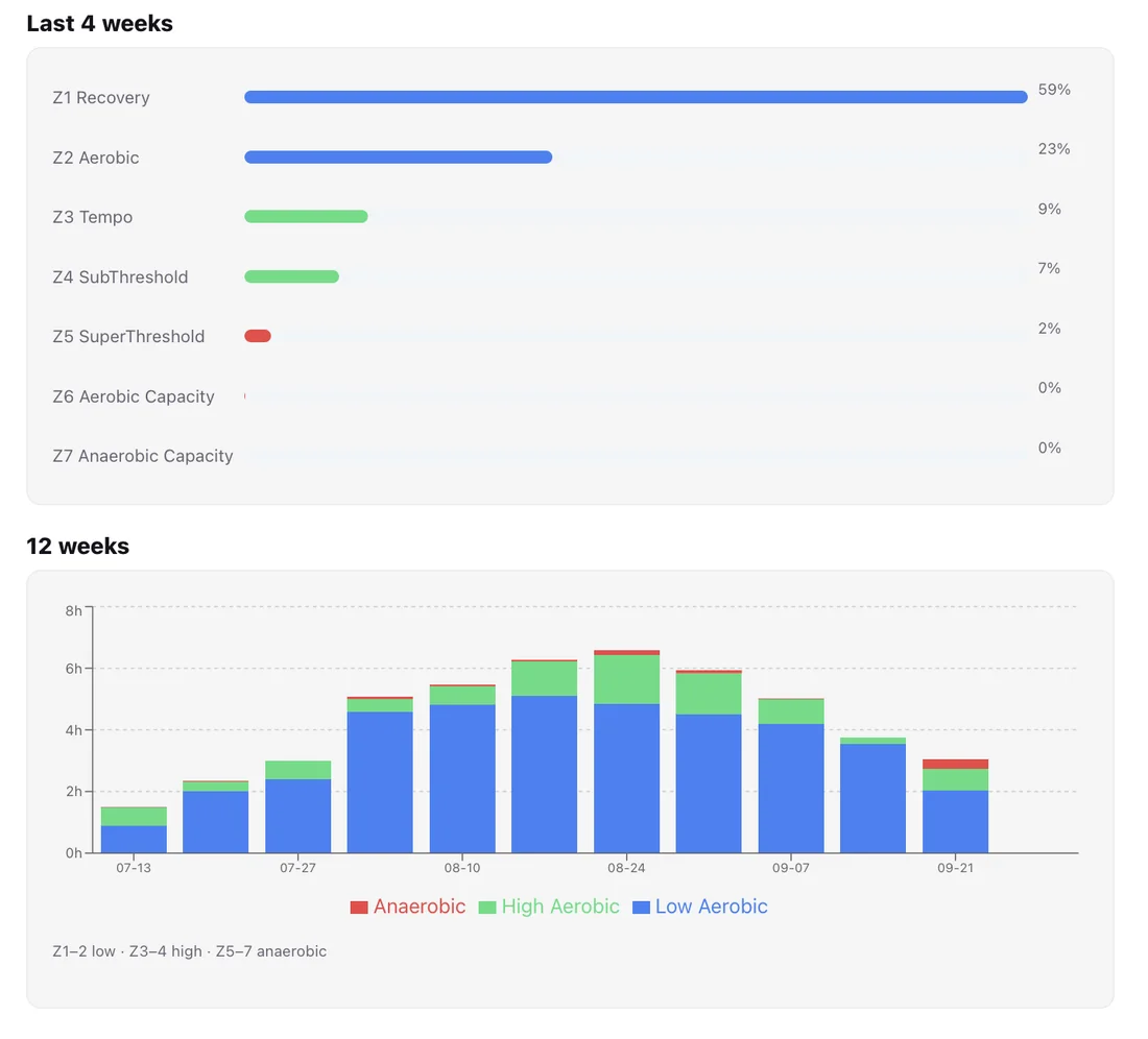
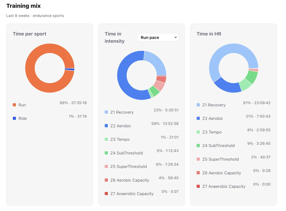
Time in Zones shows how much training time an athlete has spent in each of the seven heart-rate zones. Two views are available: a breakdown of the last four weeks and a stacked chart showing the distribution week by week over the past twelve weeks.
For a coach, this is one of the most practical metrics available. It shows whether the athlete is actually training at the intended intensities. A plan built around mostly easy running should result in most time being spent in the lower zones. If an athlete consistently runs easy sessions too hard, this will be visible here.
Time in Zones requires a threshold heart rate to be set for the athlete so that recorded heart rate can be assigned to the correct zone.
Personal Records and the Pace Curve
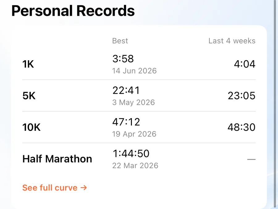
Personal Records show an athlete's best efforts across standard distances, based on their recorded training and race history. Alongside the all-time best, a separate column shows the best effort over the last four weeks, making recent improvements easy to identify.
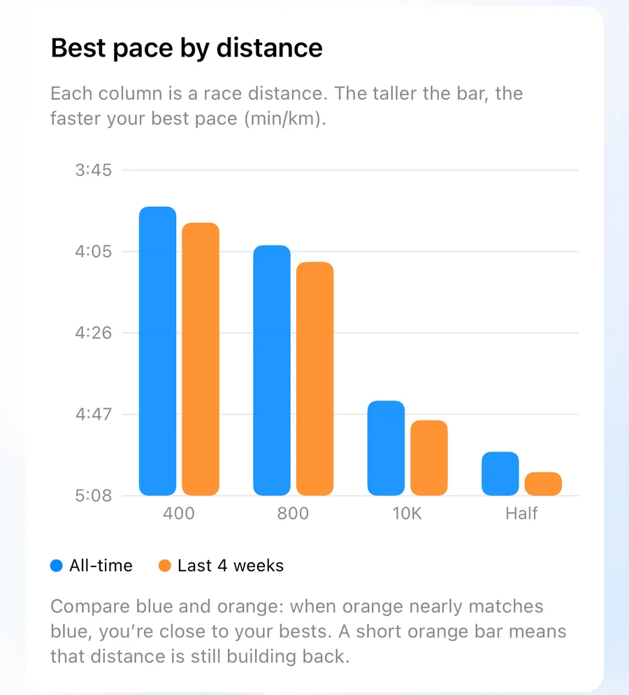
The Pace Curve extends this across the full range of distances, from short efforts to marathon length. It shows the athlete's best pace for each distance, making it easier to identify strengths and weaknesses — for example, an athlete with strong short-distance performances but a relatively steep drop-off at longer distances.
Sport Mix
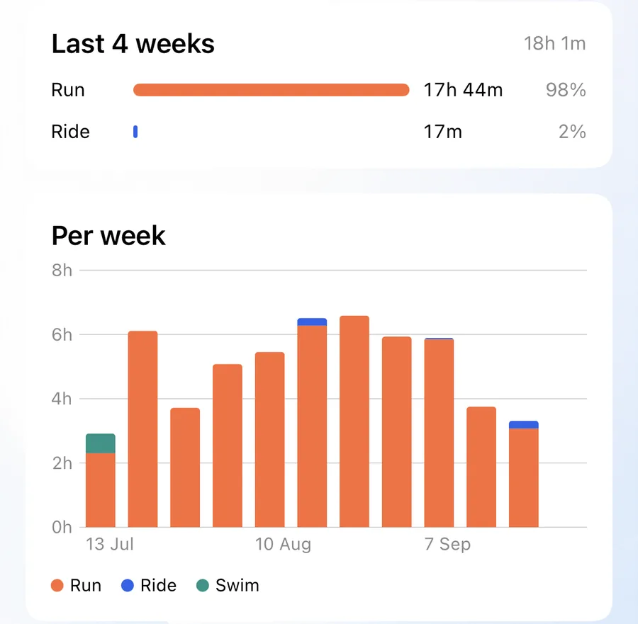
Sport Mix shows how an athlete's training time is divided between running, cycling, and swimming. For athletes who cross-train or are preparing for multisport events, this provides a clear view of how training time is distributed across disciplines.
Where Coaches See These Metrics
All of the metrics above are available on the 42Runs web dashboard for every connected athlete, as well as to athletes themselves in the app. A coach can review an athlete's performance data directly, without relying on screenshots or manual exports.
These metrics support coaching decisions; they do not replace them. They are most useful when combined with the coach's knowledge of the athlete and regular communication about how training feels.
More information about coaching on 42Runs is available on the For Coaches page.